Project Overview
Through customer feedback, Dalinghaus Construction learned that users were struggling to find the information they needed on the company website. The original website looked and navigated like a blog. This was intentional. The companies original goal was to focus on creating content in order to improve SEO rankings and attract organic traffic. While the site was great at pulling in organic traffic, it wasn't as successful converting those visitors into customers.
My task was to create a website that clearly directed users to the information they needed in order to increase conversion. Existing pages were fully redesigned with this goal in mind and new pages were created to funnel users toward action.
Project Designs:
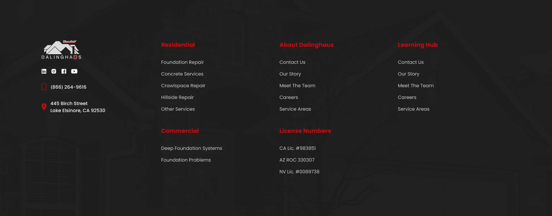
Navigation (desktop + mobile)
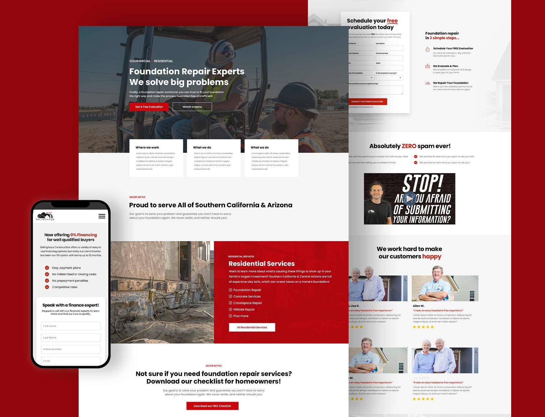
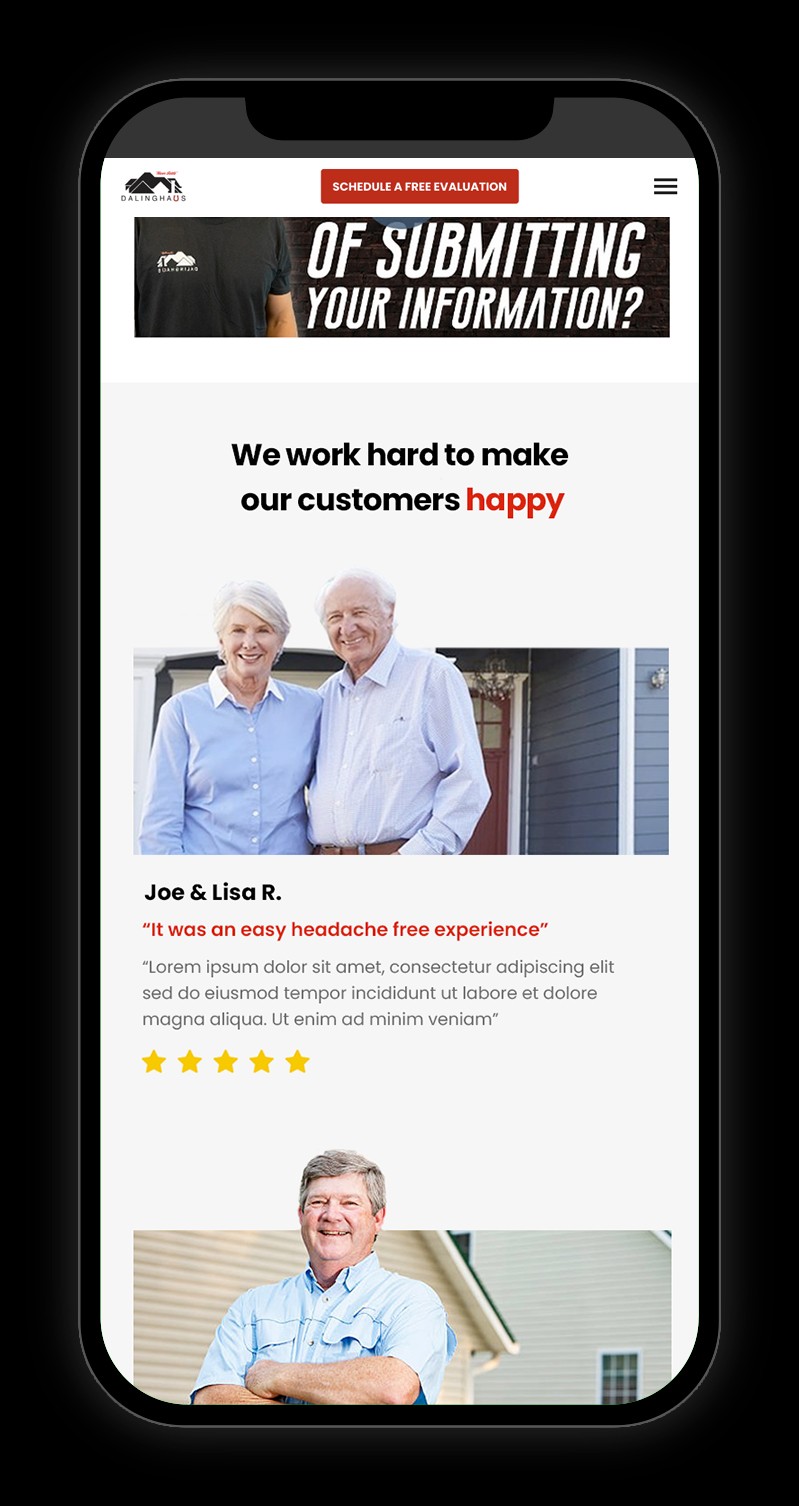
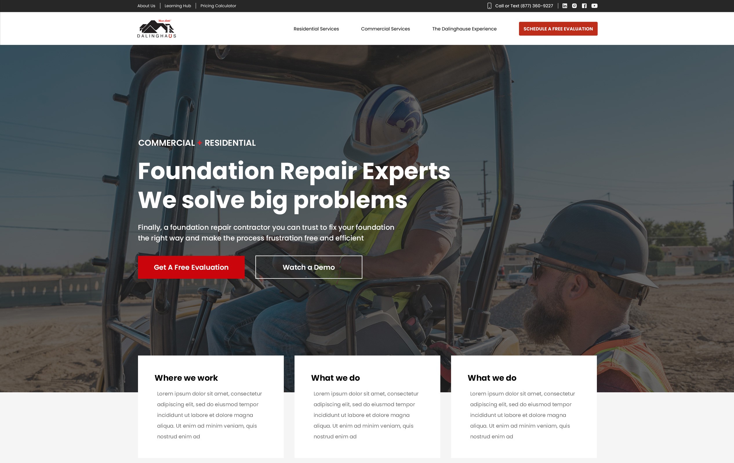
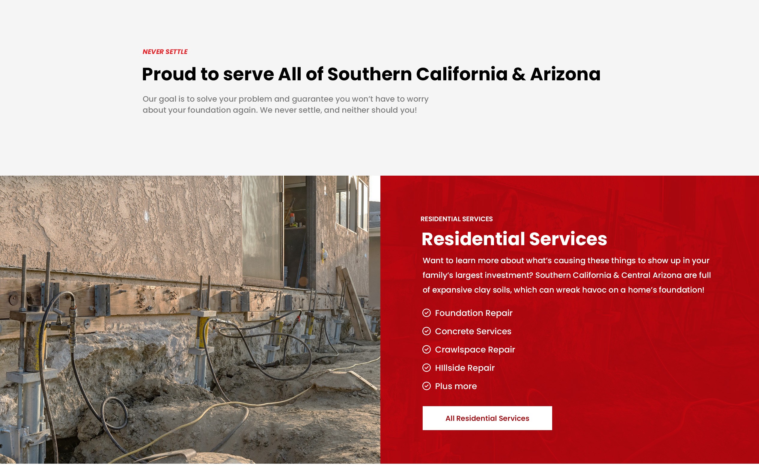
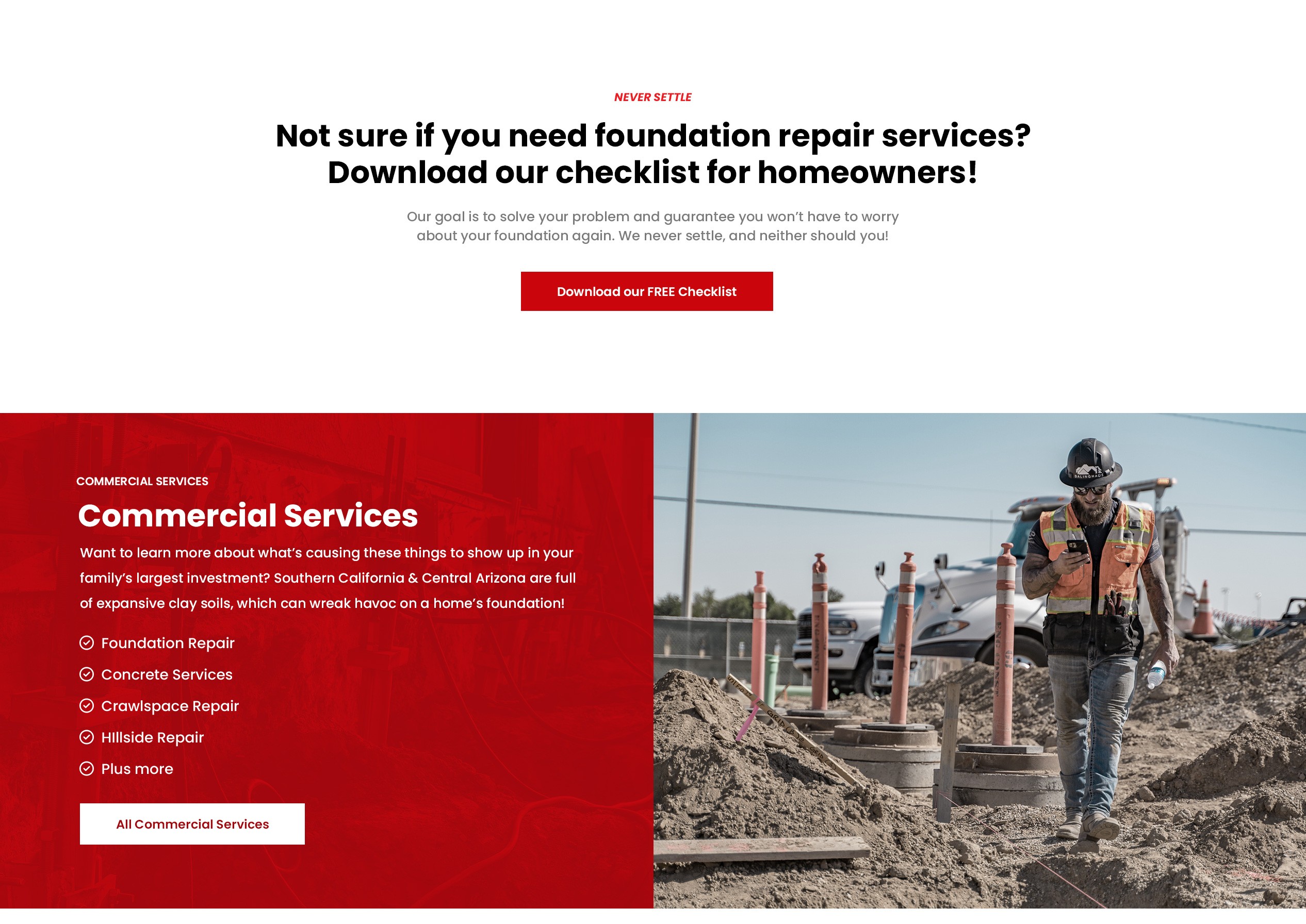
Homepage
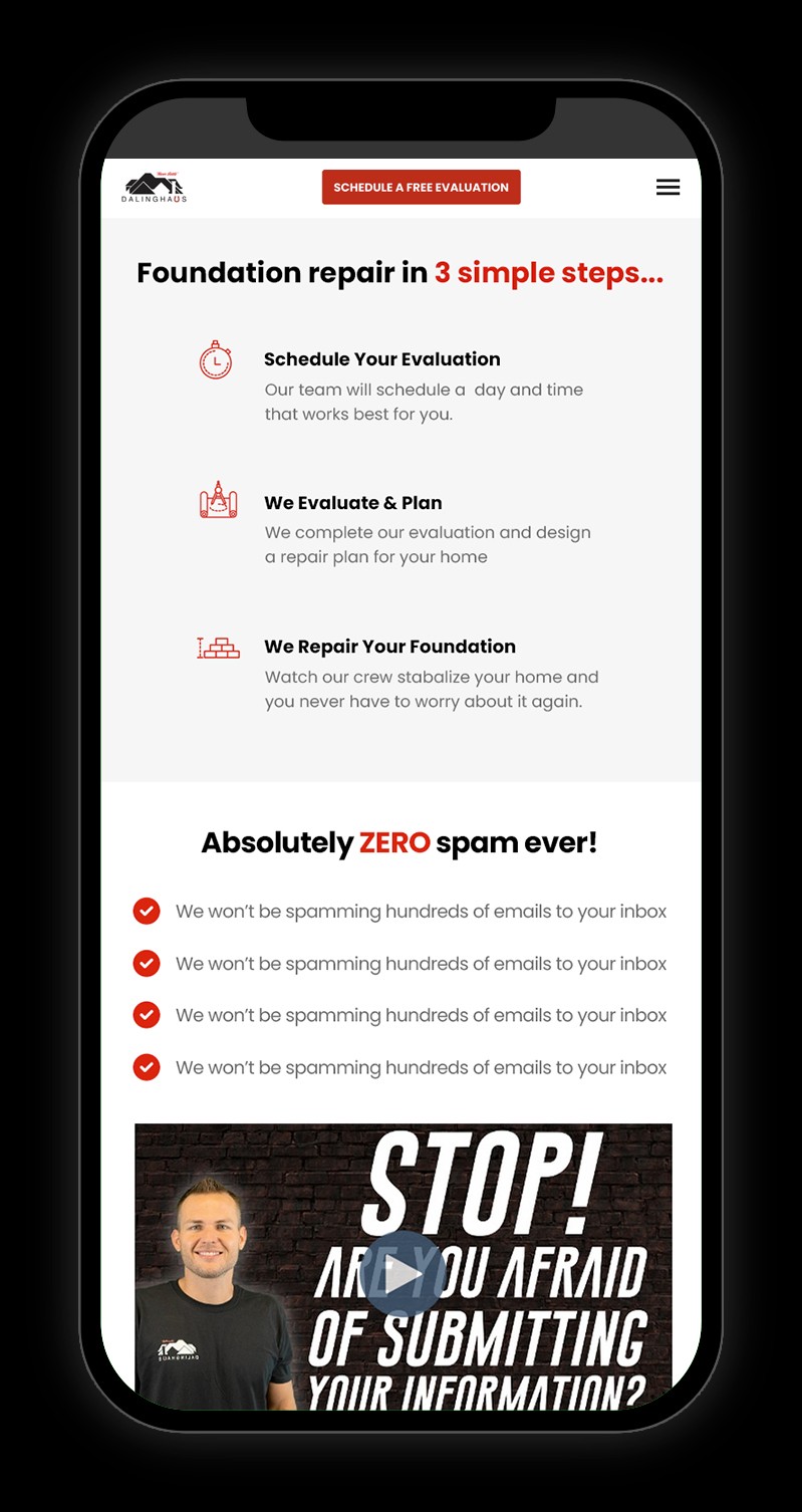
Free Evaluation Landing Page
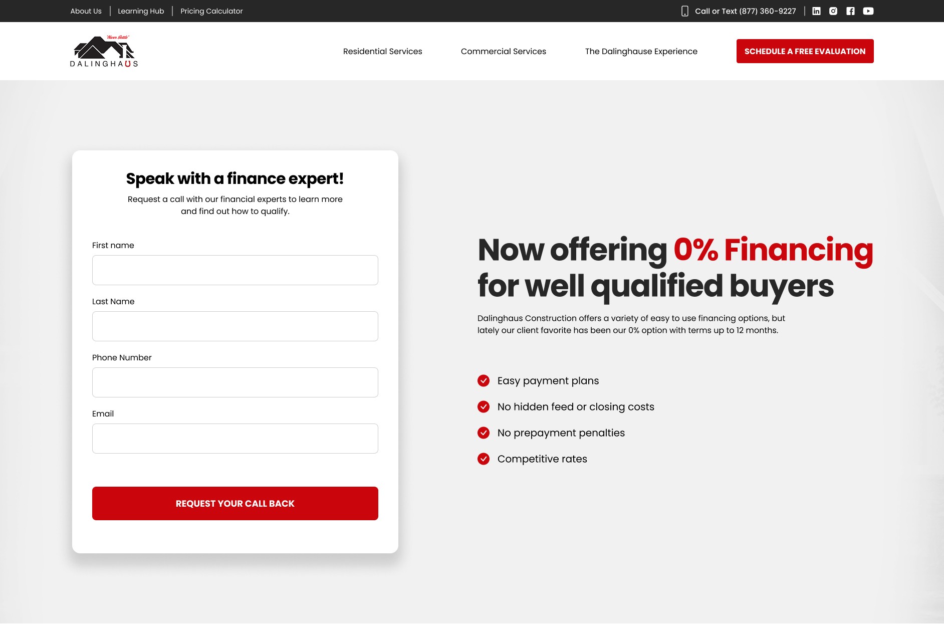
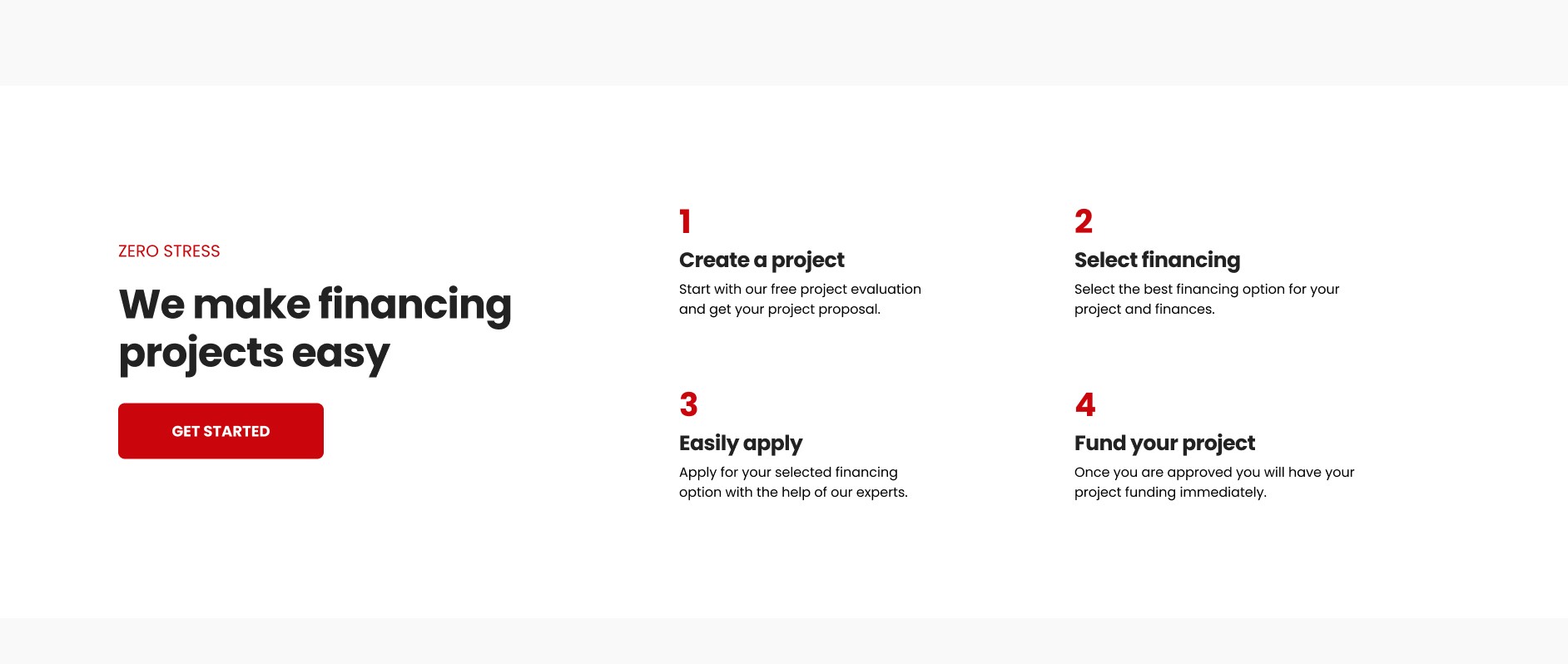
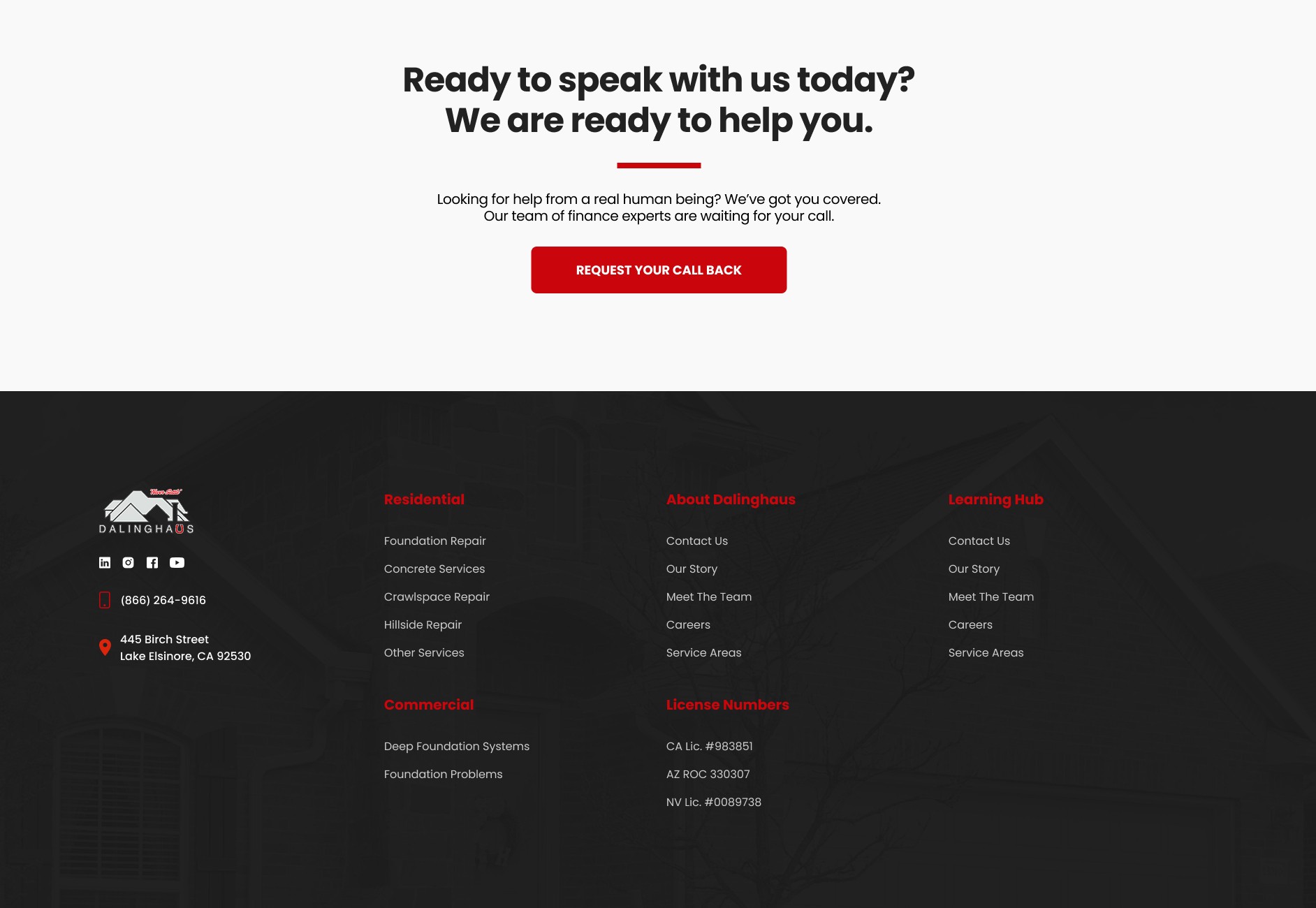
Financing Landing Page
Project Pricing Calculator
"Make it feel less like a blog"
This was a recurring quote from the team at Dalinghaus. While content will continue to be a large part of the online strategy, the main pages should clearly guide customers to what they are looking for and drive them to convert. They also wanted me to understand and implement the StoryBrand Framework in page design and layout.
New pages and page goals:
Homepage - Who we are and what problems we solve. Get users connected with our team.
Navigation - Remove bloat and focus on essential items. Improve mobile UI.
Free Evaluation - Guide them to the information they need and connect with our team.
Financing - Share our offers and connect them with a finance expert.
Pricing Calculator - Allow customers to easily get a quote online.
Old Homepage Design
New Homepage Design
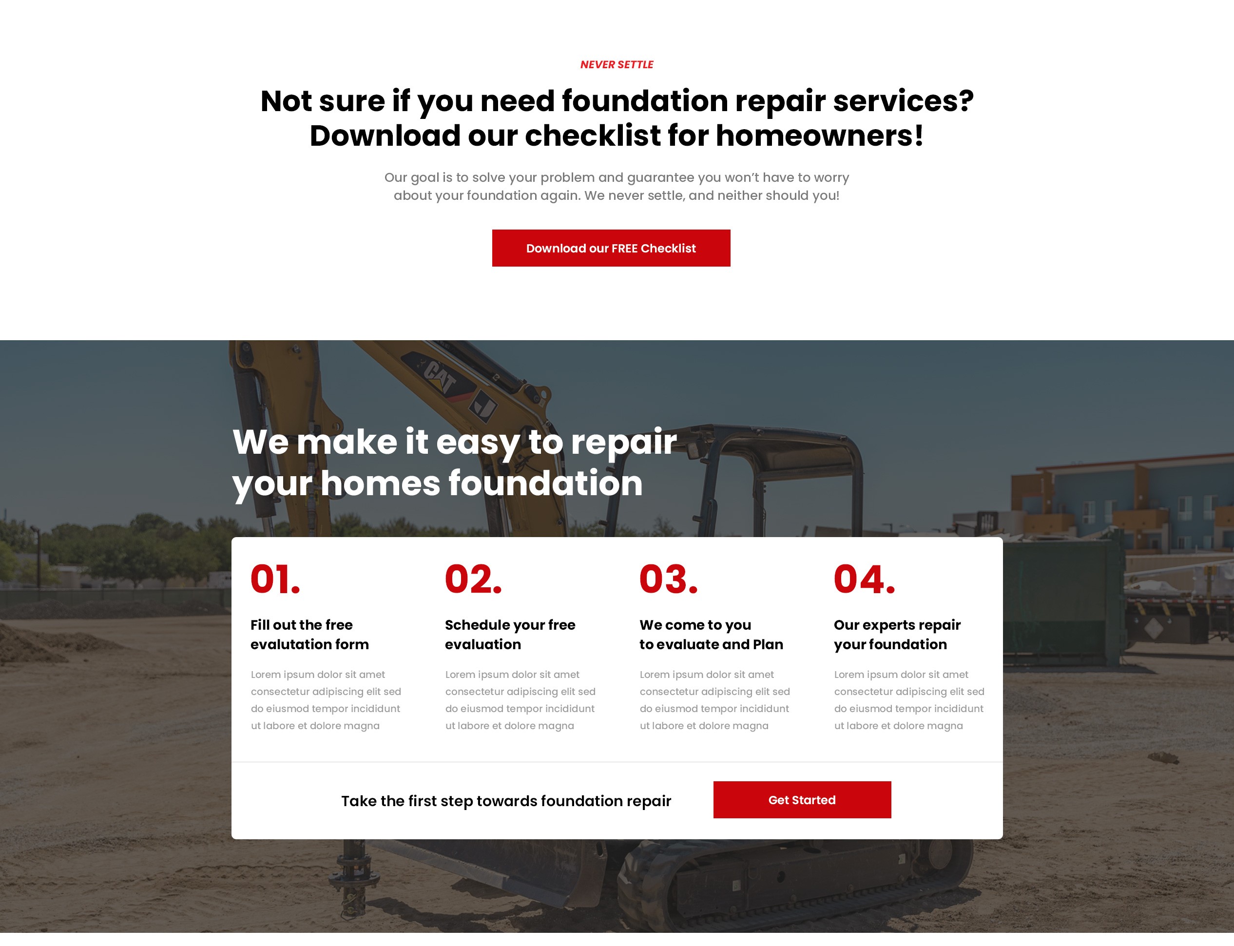
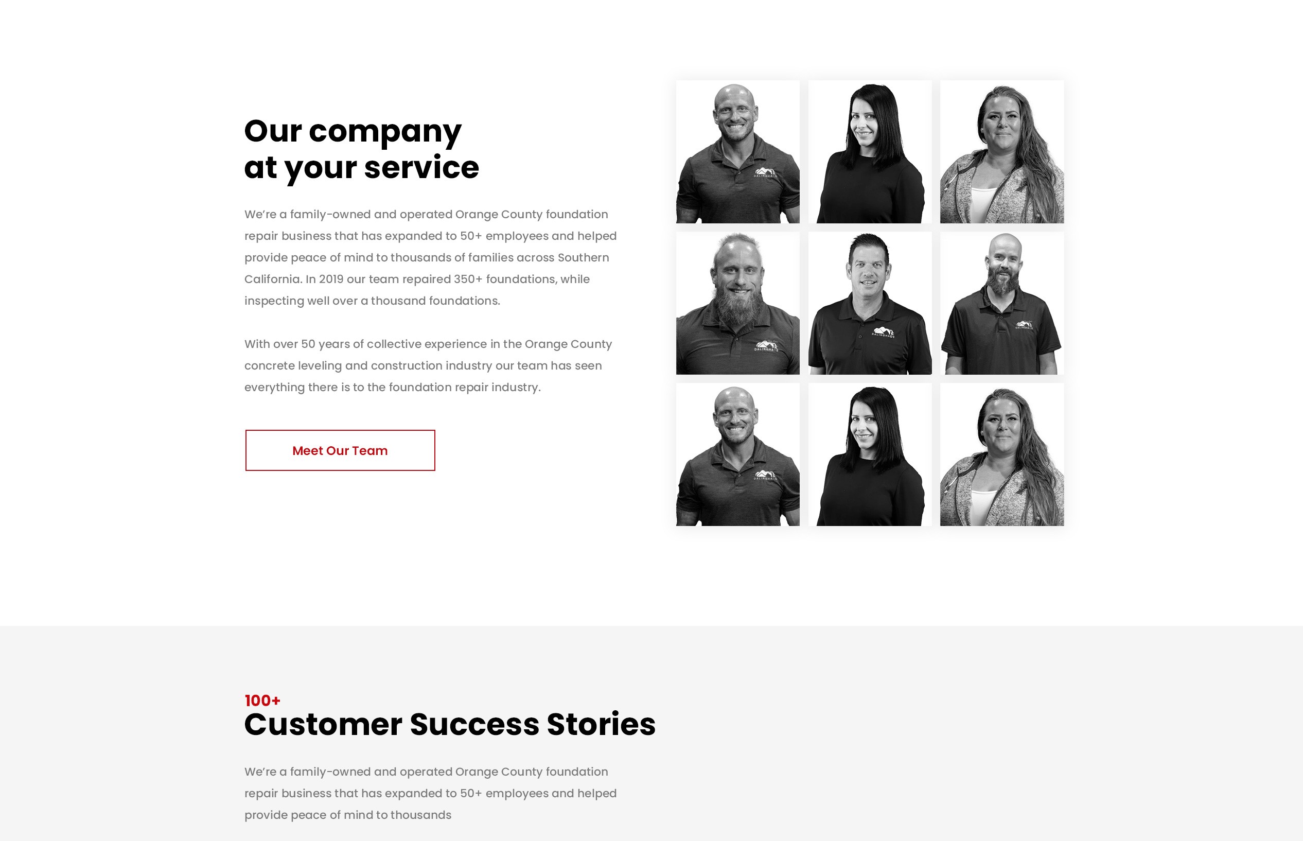
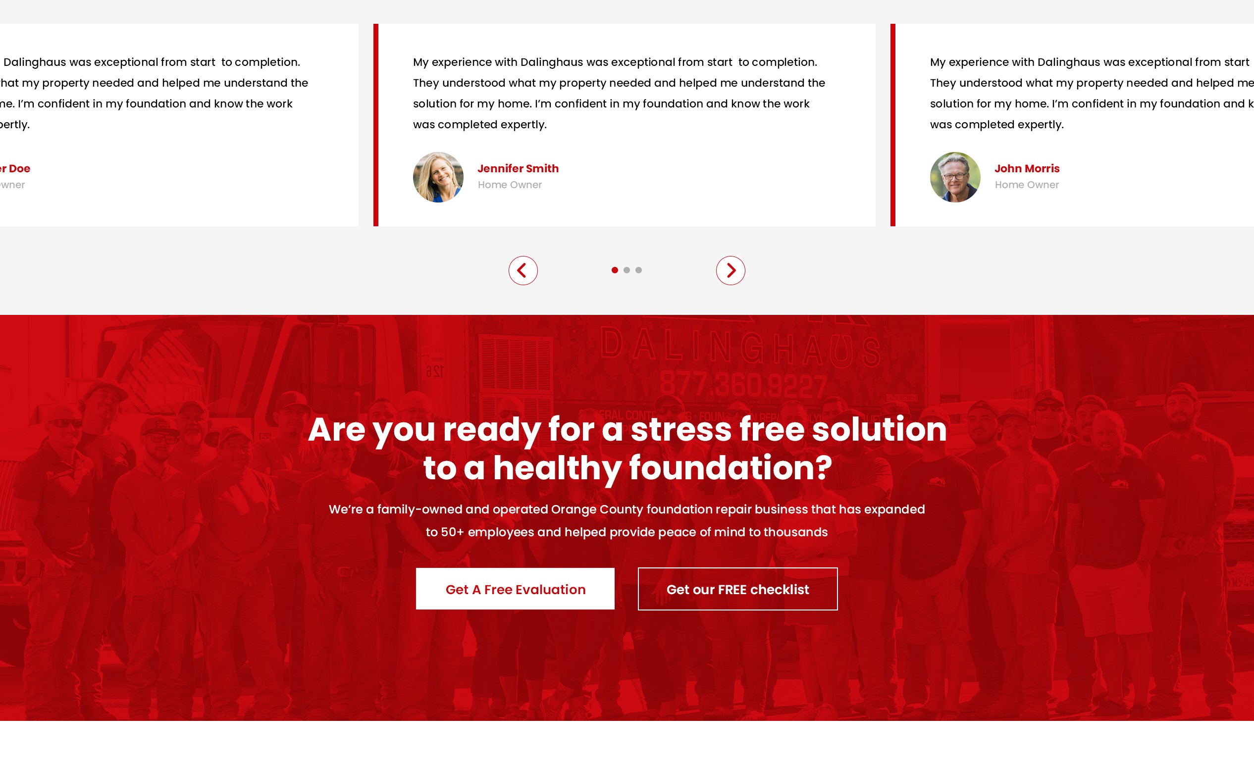
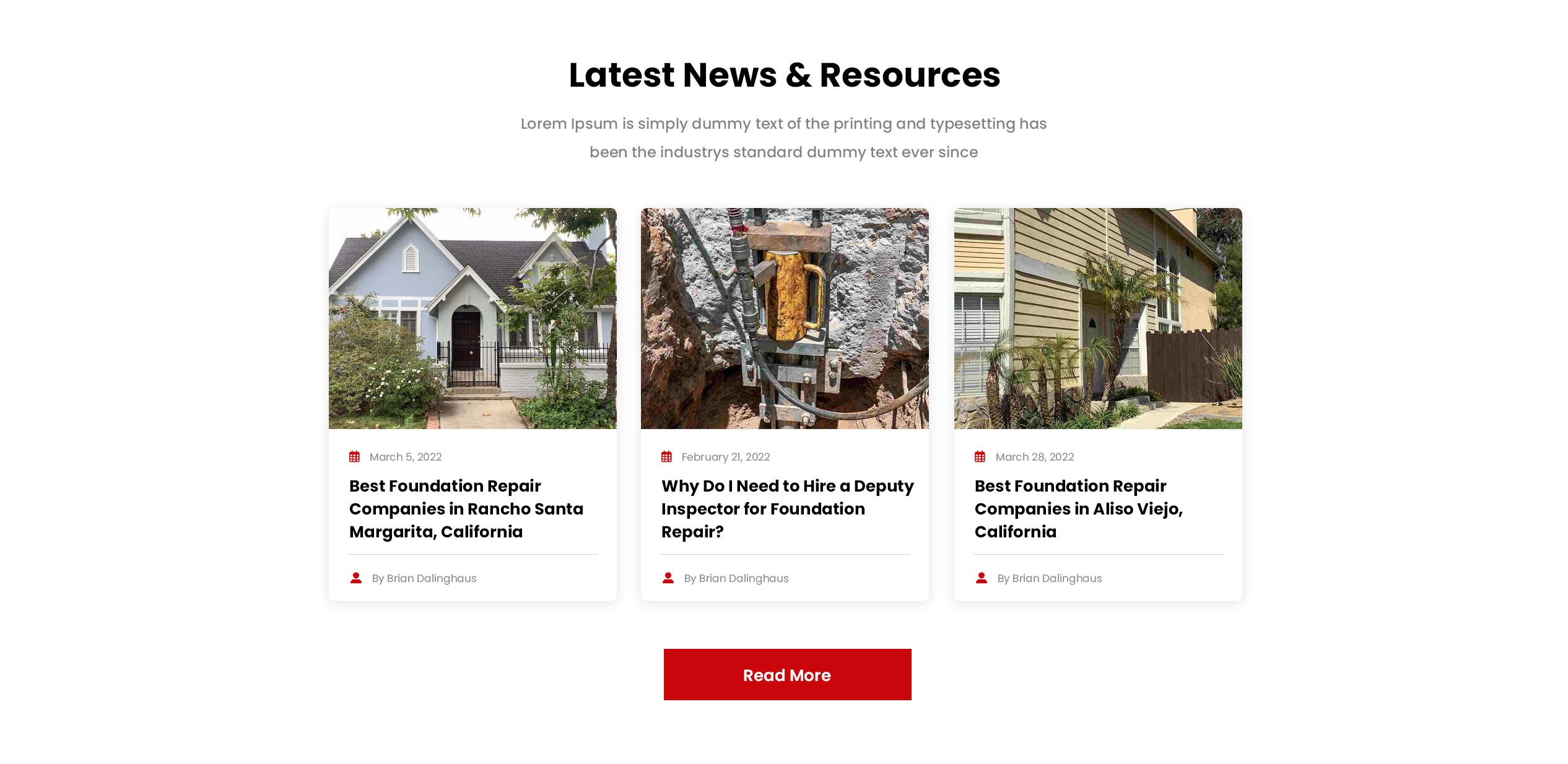
Updated Mobile Layouts
Financing Offer Landing Page

"How can we create consistent designs?"
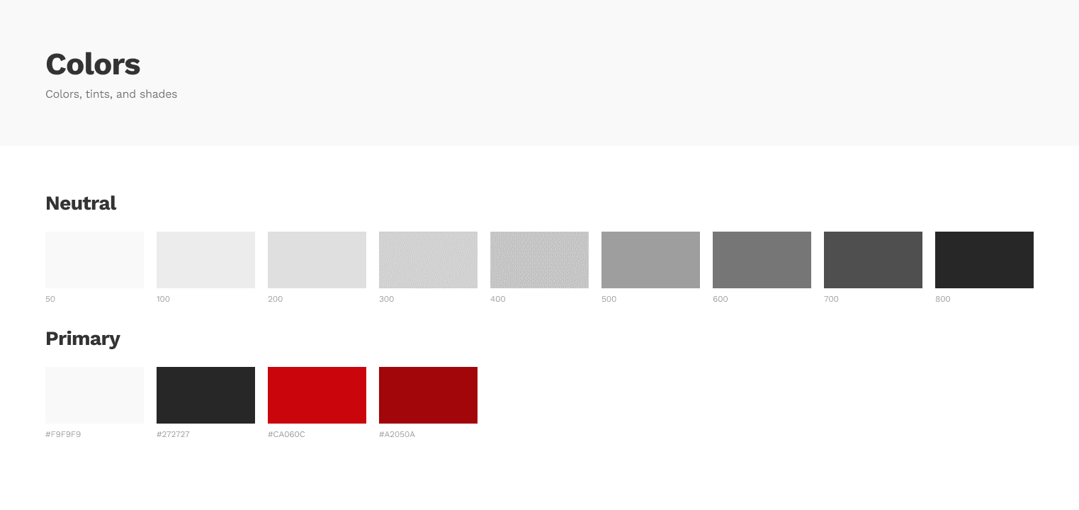
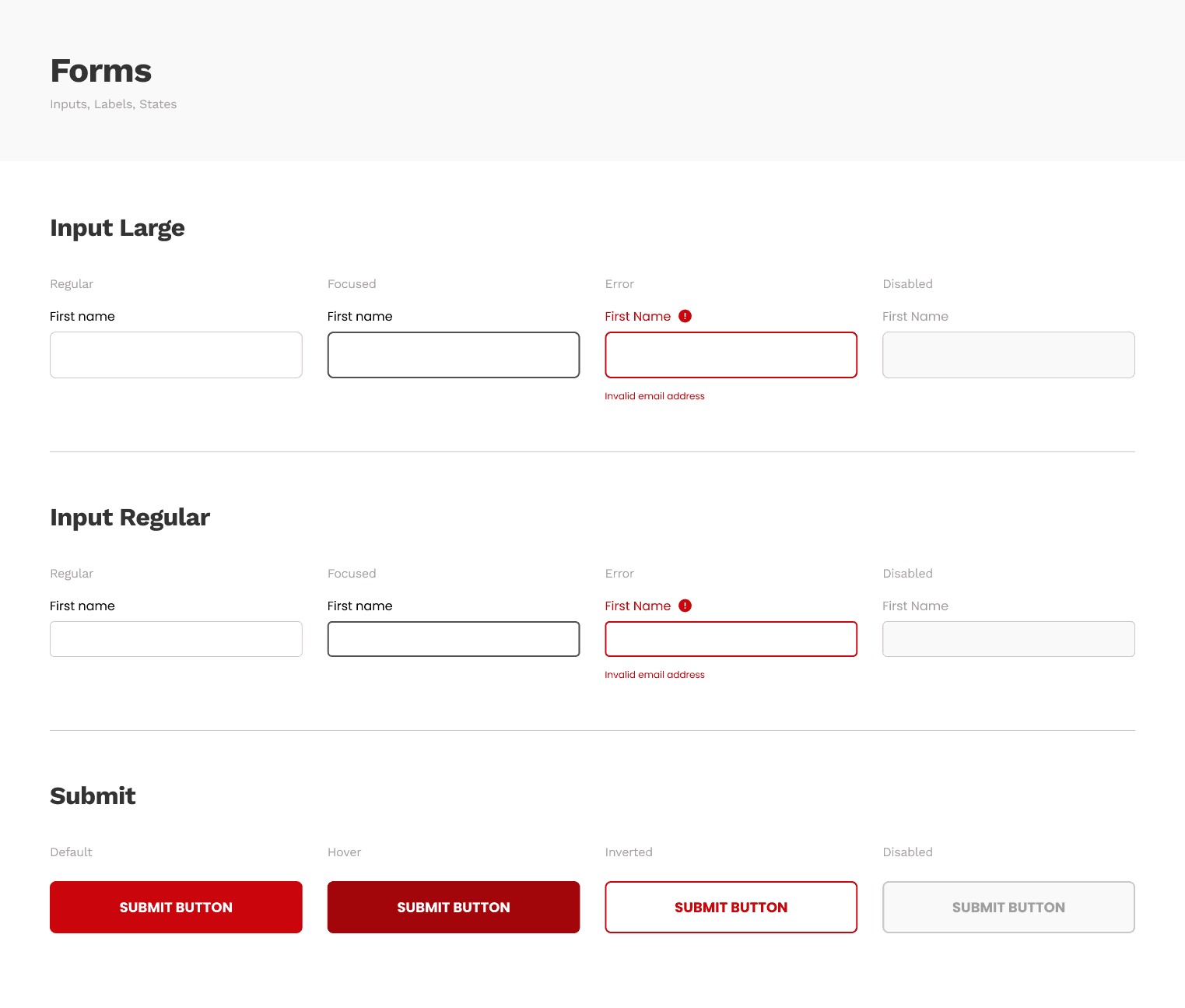
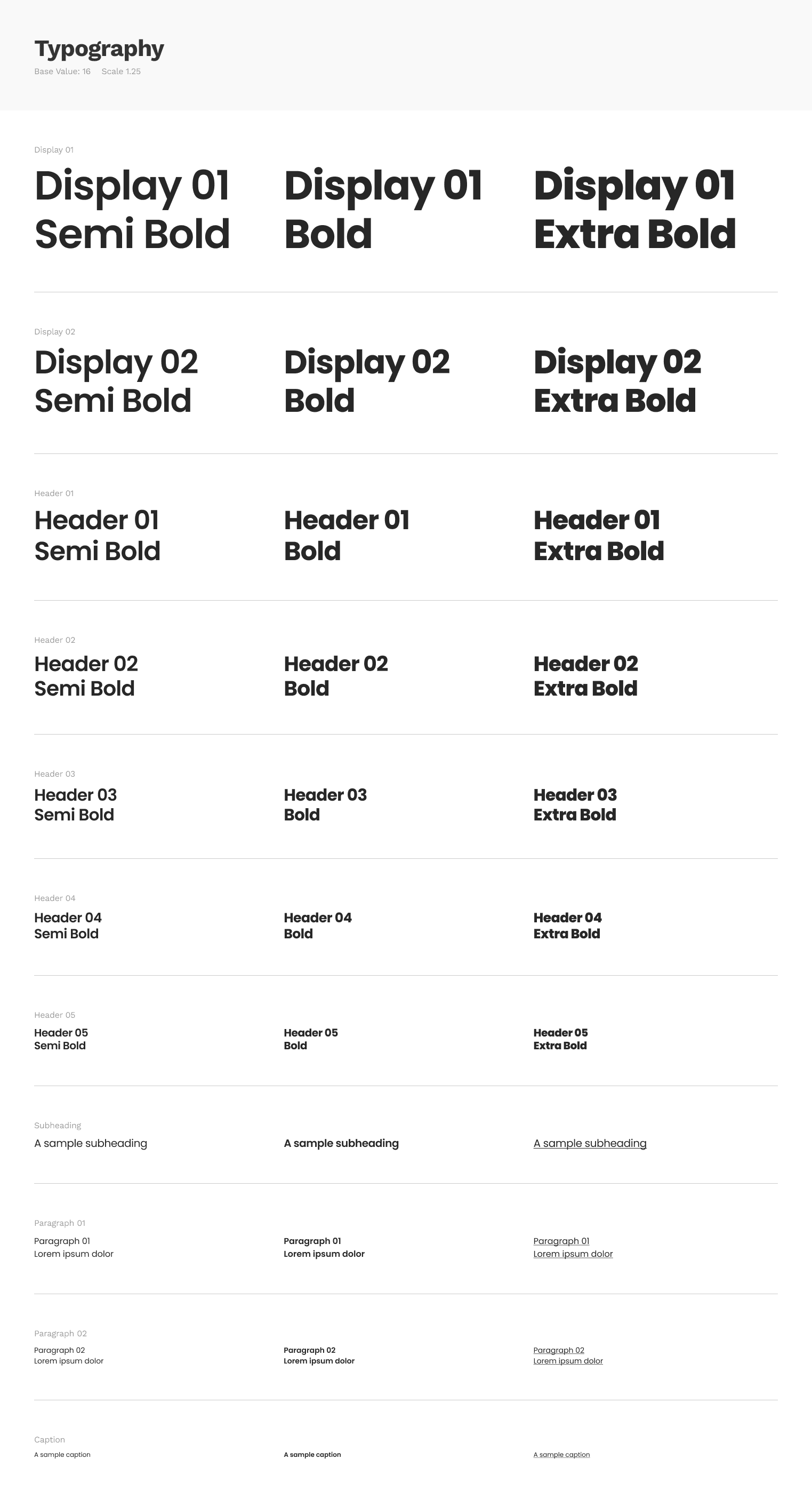
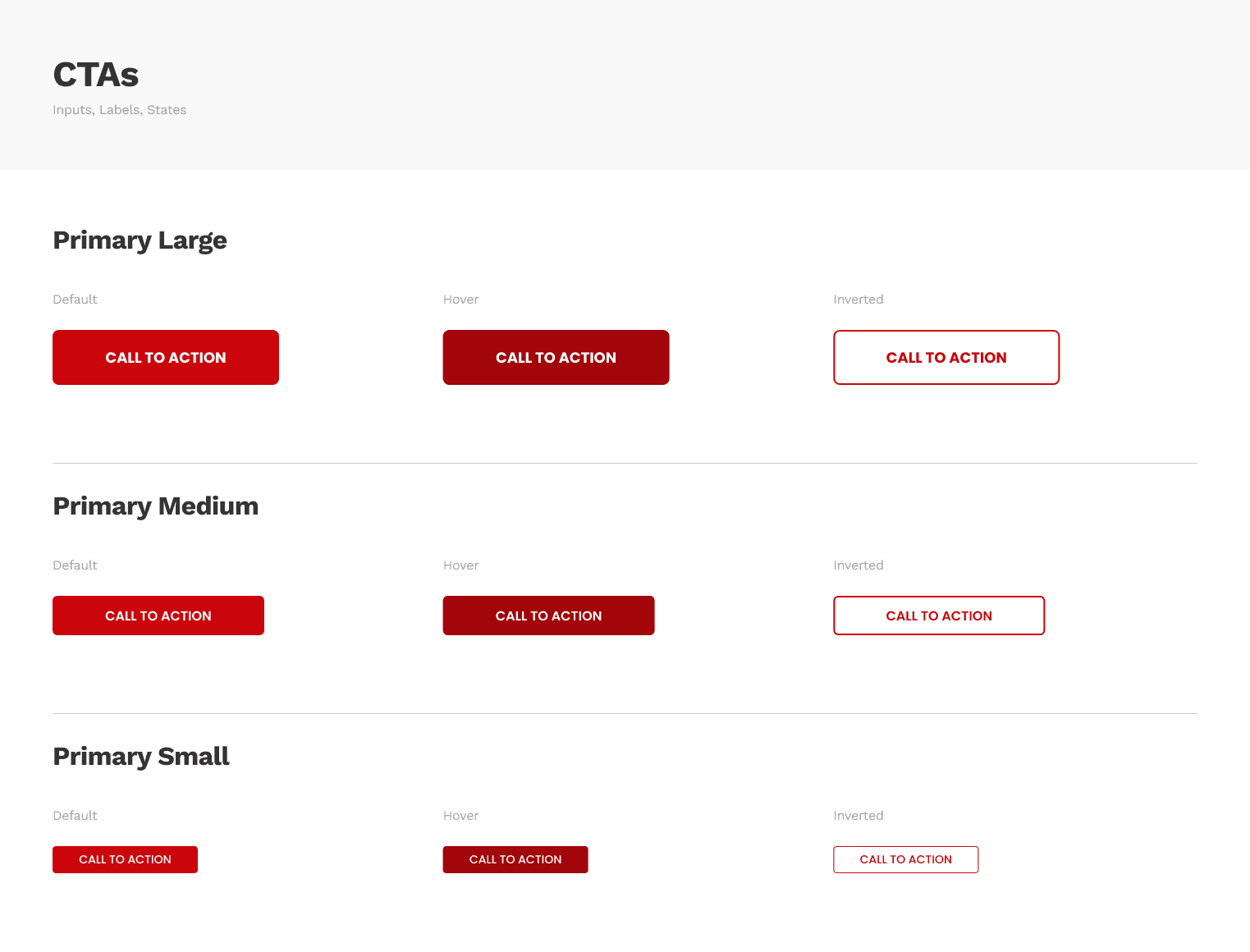
Dalinghaus wanted to be sure that the designs would be consistent across all areas of the website. In order to keep things consistent and allow them to scale these designs in the future I started creating a design and component system.


